Visuals are for representation of the interface not real clients.
Company
Whisbi
Role
Product Design
Year
2022
Brief
Whisbi is the leading platform in live commerce and telephony solutions for enterprise in the digital era.
The project consisted on a full redesign of it’s four main products: Whisbi Engage, the video streaming platform; Whisbi Sell, their proprietary one-to-one and telephony solution; Whisbi Backstage as their self-serving configuration platform and the Agent Platform, including two native apps for iOS and Android.
Additionally we where tasked with spearheading the development of a new Design System that would bring all products together in a unified design language to seamlessly integrate them .
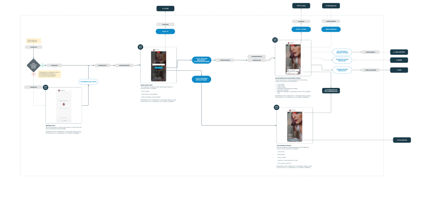
Mapping the UX
When joining a new product team, the first step is to assess the current state of the product. This involves getting hands-on with the product to understand its functionality and user flow. Collaborating closely with the front-end development team, we explored and documented all the screens and interactions currently in production. By creating a comprehensive visual map of the entire user experience, we provided a clear reference point for all stakeholders. This map facilitated discussions about potential improvements and changes, ensuring that everyone had a shared understanding of the product’s strengths and areas for enhancement. Ultimately, this process laid the groundwork for a strategic approach to redesign and development, focused on delivering a cohesive and user-centered experience.


Drag the handle to compare before and after
Redesigning the interface
A complete overhaul of the interface allowed us to rebuild some features to enhance functionality, streamline the user experience, and address any usability issues that may have emerged over time. By implementing a modern design language and optimizing the layout, we created a more intuitive and aesthetically pleasing interface. This redesign also enabled us to integrate new technologies and tools, providing users with a more powerful and flexible platform. Improved navigation, clearer visual hierarchy, and enhanced accessibility were key focuses, ensuring that users could achieve their goals more efficiently. The updated interface not only improved satisfaction and engagement but also positioned the product to better meet future demands and challenges.
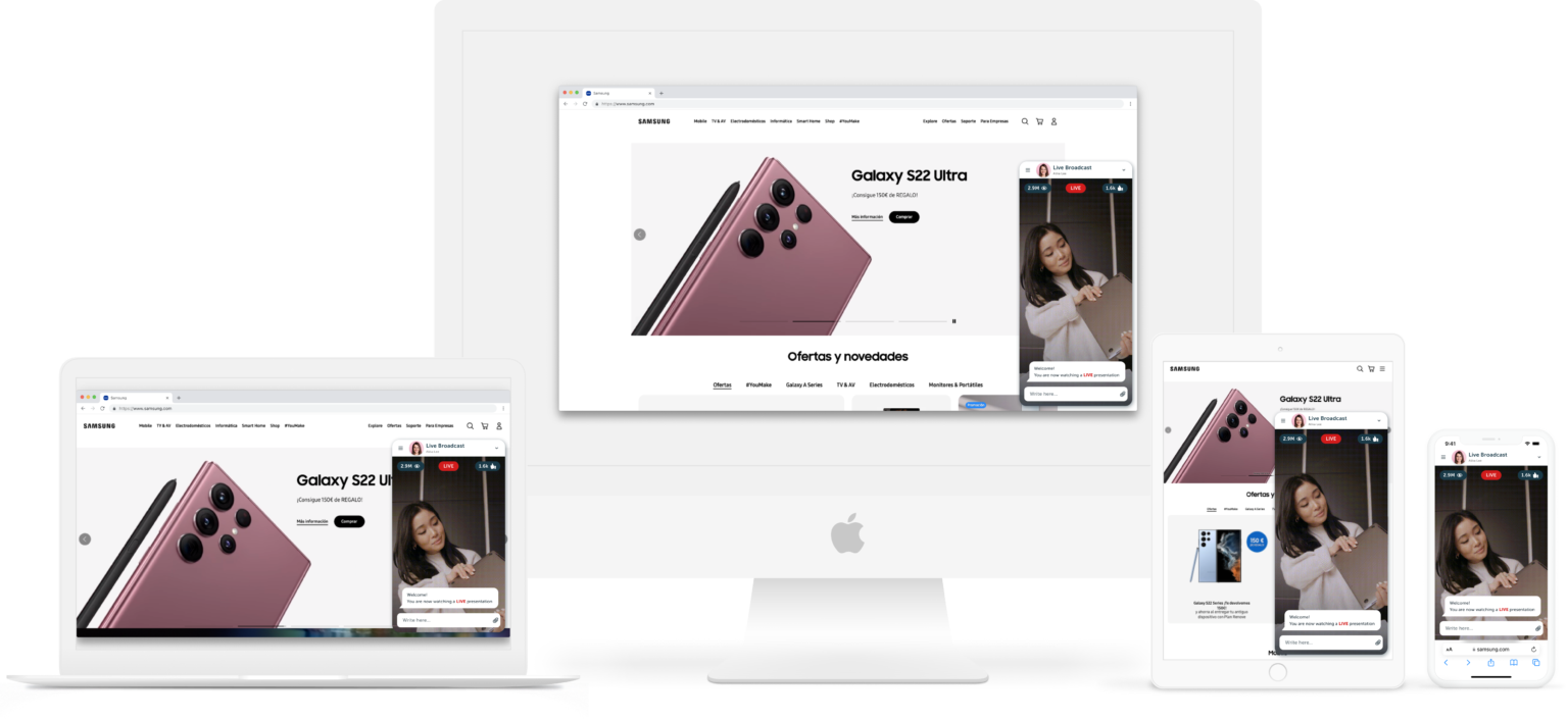
Mobile first
From the beginning, the priority was to make the experience accessible and available to all screen sizes. This meant designing with the smallest screens in mind, ensuring that navigation and key functions were intuitive and efficient on mobile devices. By focusing on mobile usability first, we could then progressively enhance the design for larger screens, adding more complex features and richer interactions where appropriate. This approach not only catered to the growing number of mobile users but also guaranteed a consistent and high-quality experience across all devices, from smartphones and tablets to desktops. Moreover, it facilitated faster loading times and better performance, essential for keeping users engaged in a mobile-dominated world.
Data driven
With a strong focus on insightful information, the Backstage was designed to provide a reliable and useful platform for monitoring and configuring the products. The platform empowers users to make informed decisions based on real-time performance metrics and usage patterns. This ensures that users can quickly identify trends, detect anomalies, and optimize configurations to enhance product efficiency and effectiveness. Additionally, the intuitive dashboards and customizable reports make it easy to visualize key data points, facilitating better communication and collaboration among team members.
One system to rule them all
Designing for the digital realm means having a plan for every situation. With clear directives and flexible rules, we were able to adapt our product to a variety of screens. This approach involved creating a robust design system that included a comprehensive set of guidelines for typography, color schemes, spacing, and component usage. By standardizing these elements, we ensured a consistent look and feel across all devices, from mobile phones to desktop monitors. The design system also allowed for scalability, making it easier to introduce new features and updates without compromising the user experience. Additionally, this cohesive framework enabled the team to work more efficiently, reducing development time and minimizing errors. Ultimately, our unified design system provided a seamless and adaptable user experience, reinforcing the product’s reliability and appeal in a dynamic digital landscape.

Drag the handle to compare before and after
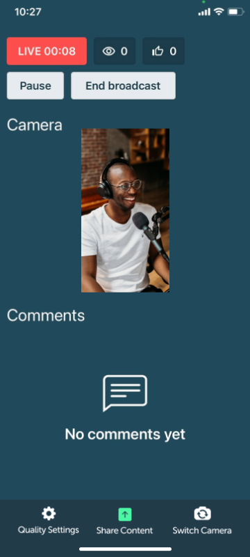
Fully native apps
Supporting powerful features requires capable technology, and leveraging the native capabilities of both iOS and Android allows the app to fully utilize the specific hardware and software capabilities of each platform. This approach ensures optimal performance, with smoother video playback, faster load times, and more efficient use of device resources. By utilizing the full potential of each operating system, we can deliver a more intuitive and responsive interface, tailored to the unique design and interaction patterns of iOS and Android users.